
Pushing the limits of credit and risk decisioning
Real-time insights and predictive models to understand how borrowers spend, save and earn their money. From the past to the future, with Atto.
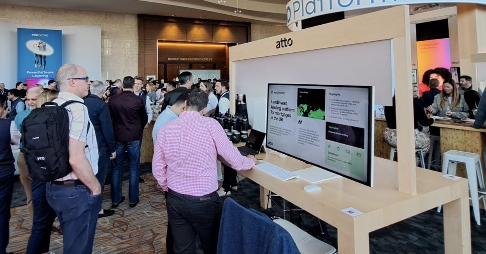
Powering household names with real-time customer insights


Atto insights
Understand how your customer’s spend, save and earn their money with real-time insights.
Making lending more informed than ever before
Get a fuller, deeper understanding of your customers' financial profile.

Welcome to the most up-to-date data dashboard
See what your customers are spending, saving and earning today with Atto.

Last month's data
is history
Atto uses today's insights to better predict tomorrow.
Better informed decisions across the credit risk lifecycle
Credit risk decisioning
Understand customer affordability and creditworthiness in real-time.

Risk modelling
Enhance predictive models with real-time open banking data for a significant uplift in performance.


Better quality data. Better quality portfolio.
Lenders choose Atto to fill the gaps in their traditional prediction models; to bring colour to data that was black and white.
Credit risk makes us, us
Credit risk is our bread and butter - it's who we are. All of Atto's insights and models have been built with one mission at heart: to create a more predictable future for lenders.
The earliest open banking pioneers
Our team built the first ever AISP connection after PSD2. Since then we've given some of the world's most established providers the power of foresight.
Credit risk categorisation
Every piece of insight we provide is built on the foundation of dynamic, accurate categorisation optimised for credit risk decisions - with over 90% accuracy.
Latest news
What our customers say
Frequently asked questions
What is open banking and how does it work?
Open banking is the practice that allows people and businesses to share up to 12 months of transaction data. Atto is regulated by the Financial Conduct Authority as an Account Information Service Provider (AISP) - the intermediary who safely facilitate this process.
What is transaction categorisation?
Transaction categorisation is the process of adding context to raw transaction data. The process gives you an understanding of what your customers' spend their money on and where.
Read moreHow does bank account verification work?
Using the API, A matches the details provided from your customer to those on their account. We apply a set of sophisticated algorithms and rules to verify the name, and then tell you what does and does not match.
Read moreHow do you verify income with open banking?
After a customer shares their data, Atto identify recurring credits to the account and group these. Using an algorithm we identify the monthly income for each income stream. We then return the calculated income and confidence score to you.